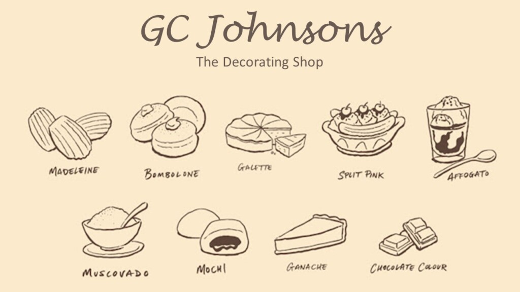
A curated collection of warm, neutral shades of honey, caramel and chocolate, each colour inspired by delicious desserts and some of the world’s most tasteful sweet treats. Mouth-watering names including ‘Madeleine’, ‘Galette’, ‘Affogato’, ‘Muscovado’ and ‘Ganache’ bring these enticing colours to life. Explore the Sweet Treats colours below.

This muted gold colour elegantly serves the space between muted-yellow and warm-neutral. It takes its name from the delicate, shell-like sponge cakes.

This mellow, honeyed shade is inspired by bomboloni, the signature Italian doughnuts.

This mid-weight orange-brown shade was faithfully reproduced for the stage doors at the only surviving Regency playhouse in Britain; Theatre Royal in Bury St Edmunds.

An elegant warm stone colour, this pink adorns the walls of the great staircase of Wimpole Hall in Cambridgeshire. Effortlessly harmonising with the various shades of the lighter colour Masquerade, Split Pink can drive an instantly successful transformation of a neglected bedroom or lounge.

Efficiently and expertly combining coffee and dessert in one mouthful (or, more politely, several mouthfuls), Affogati originated in Italy in the last century and are enjoyed the world over. This shade makes for an excellent partner to dark browns and soft blacks – use it with Lamp Black and dark furniture to create a captivating, sophisticated scheme in a casual living space.

Inspired by pure and unrefined muscovado sugar – a key ingredient in artisan bakery – this rich, deep, warm, earth-red is perfect for an indulgent space, whether a relaxing room or an everyday space such as the kitchen. Frame it with one or more of the neutral Slaked Lime Colour Scales family and your extremely tasteful scheme will be as popular as our Muscovado Meringues

The decoration and cameos on the walls in the dining room of Calke Abbey, where this shade accompanies several other pinks, greens and greys, was designed in the late 18th century. Unlike much of the property, which the National Trust has preserved in the state of decline in which it was acquired in 1985, this dining room has been restored to its original neoclassical design, providing a tantalising glimpse of the mansion’s former glory. Use Mochi to create a more contemporary, coordinated dining room or office space, alongside the deeper colour Scullery – on skirting boards and doors – and Shirting or Slaked Lime on the ceiling

Ganache was originally coined as an insult by an angry head chef in 1920s Paris. The resulting happy accident was the blend of rich chocolate and hot cream that features so profoundly in today’s patisseries. As a paint shade, it was revealed as one of several colours in an intricately painted ceiling at Blickling Hall in Norfolk, boarded over in the early 20th century and rediscovered after a flood nearly a hundred years later. With its enviable profundity, Ganache is likely to be the darkest shade in your room scheme, but consider pairing it with the even darker Chocolate Colour for a deeply committed interior design statement

It is believed that both George Frideric Handel and Benjamin Franklin had their London front doors painted in this rich, almost edible shade. The deepest of the shades in this capsule collection, Chocolate Colour works equally well inside; use it as a warmer alternative where you might previously have considered black, charcoal or a dark blue. Brighter accents such as Marigold or Orange Aurora will leap off a Chocolate Colour background, or use it as an exquisite trim colour to frame a wall of Arras or Tuscan Red.

