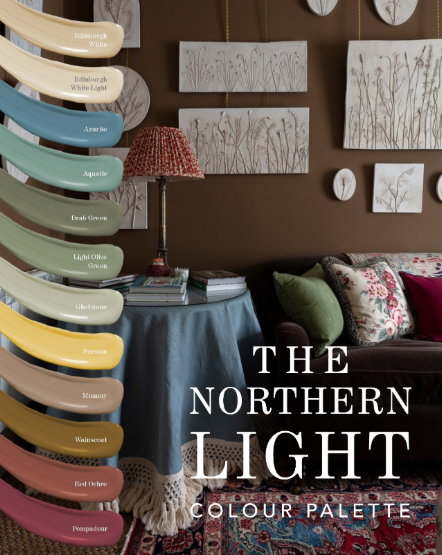
Rich Colours For Any Setting
Our Northern Light palette removes uncertainty with a harmonious range of complementary tones.
It features two new off-whites, ‘Edinburgh White’ and ‘Edinburgh White Light’, designed to pair seamlessly with the palette’s deep earthy hues.
Bringing softness and balance to low-light spaces.
Take the guesswork out of decorating rooms that lack the benefit of abundant natural light, such as north-facing rooms, basement rooms, or any room where the quality of natural light is diffuse and cool.
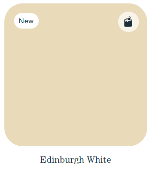
Edingburgh White

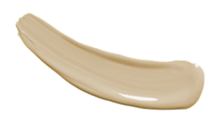
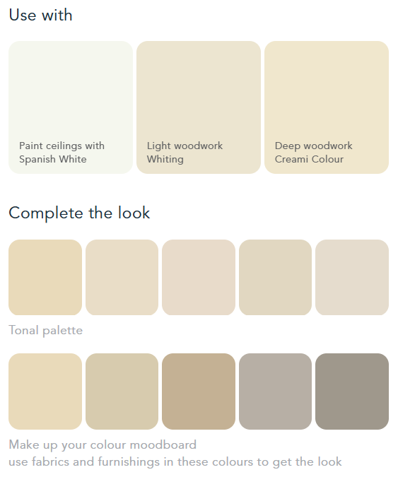
Inspired by the grand country houses of Scotland Edward collaborated with Edinburgh interior designer Jessica Buckley to create this beautifully rich shade of off-white; perfect for using in any north-facing room or one which doesn’t benefit from good natural light. The warm pigmentations counterbalance cool blue-grey shades of light to ensure a warm and enveloping result. Use on walls or woodwork by itself, or team with Edinburgh White Light to achieve a variance of tones.
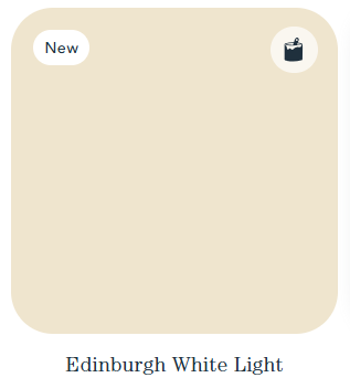
Edingburgh White Light

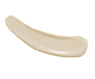
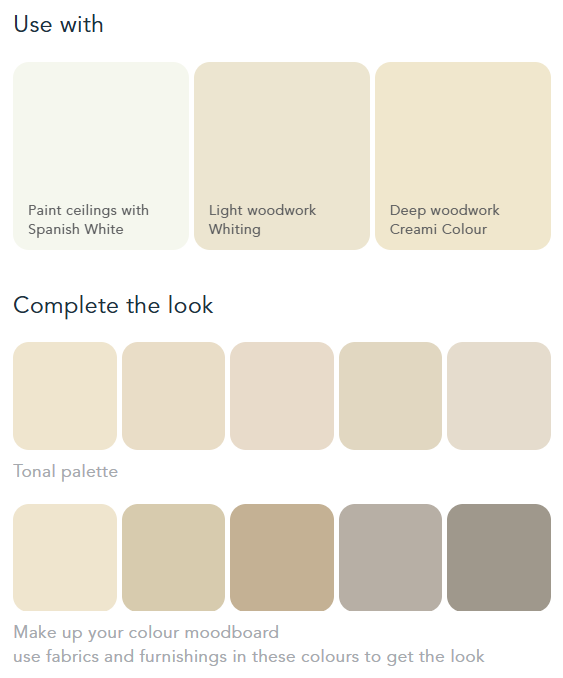
A lighter tone of Edinburgh White, this shade works perfectly for ceilings and woodwork when paired with Edinburgh White or any of the shades from the “Northern Light” palette
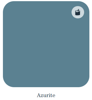
Azurite
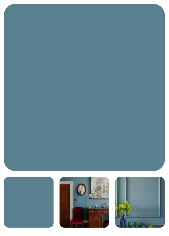
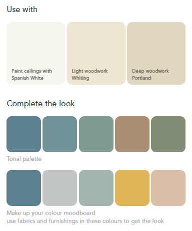
This blue is a real pick-me-up, packed with pigment to give strength and depth, but with earthy warmth. It is a homage to the mineral widely used since the Middle Ages to convey great creativity and high status. A great choice for repainting kitchen cupboards paired with lighter walls. Our paints are vegan and baby, pet and child friendly so perfect for the kitchen. We also love Azurite in our dining and living spaces, jewel like at night and colourful during the day.
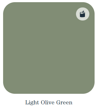
Light Olive Green
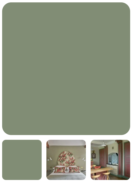
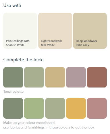
Early recipes for olive green seem to have been a browny hue but by the C19th the addition of Prussian blue meant that it was a full green close to the colour of a plump Mediterranean olive. Too dark and the colour tends to black when in the shade, so I have kept it a strong mid tone. It can be a great woodwork colour and is also robust enough for exterior use. Painting a greener future, our Light Olive Green is derived from natural sources like plant oils and mineral pigments.
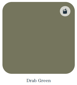
Drab Green
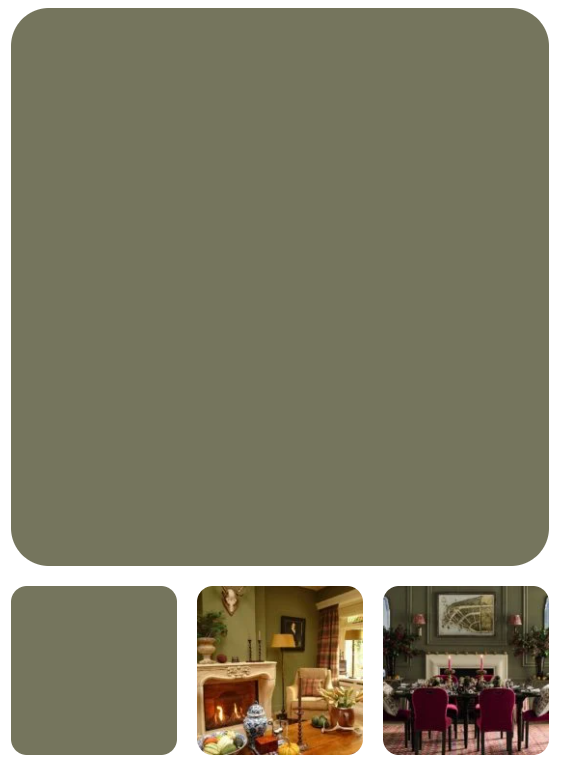
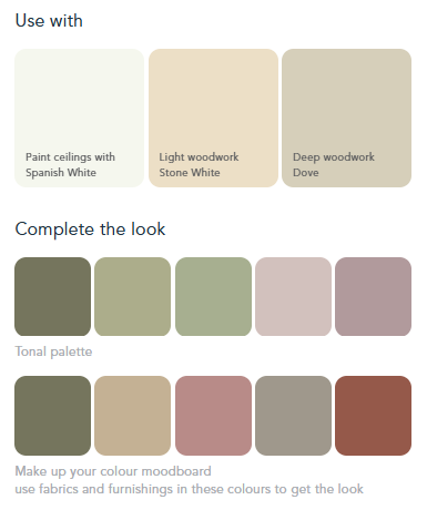
Drab referred to an un-dyed cloth (the French drap) and its use in colour terminology came to mean a lightish brown. C18th accounts refer to drab green and we have taken this idea to mix a beautiful brown green in defiance of its name. I have seen this colour used by clients to create really grown up rooms with depth and self-assurance. Great as an all-over colour for wooden panelling. Drab Green is a natural paint, made from natural raw materials and so breathable and the smarter choice of paint for period properties. Never drab, always green, in every way.
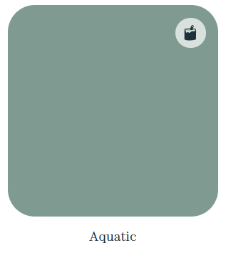
Aquatic
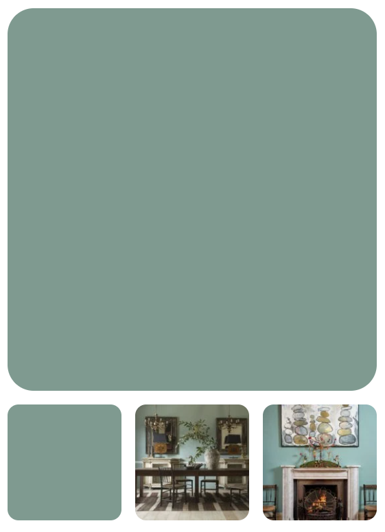
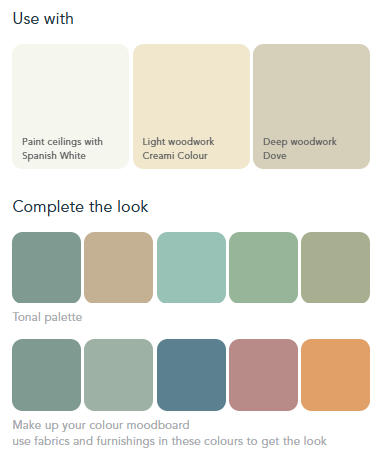
Is it blue, is it green? We don’t know but it is the changing colour of water and water is completely life enhancing! Using water to describe a colour is still the cop out it has always been since first used in Colourman’s catalogues in the C18th. Water is so fundamental to our brand as our water based emulsion and eggshells are made with innovative recipes for a greener (or bluer!) future. Aquatic will bring depth and sophistication to your space. Right between the blues and the greens, this colour has been used from the Georgian period onwards. Environmentally friendly paint at its finest!
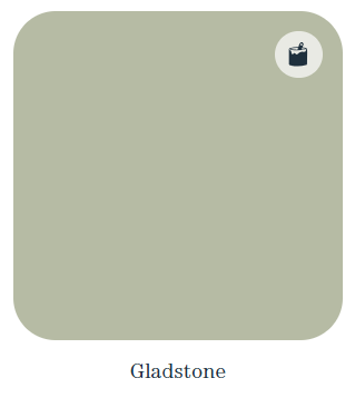
Gladstone
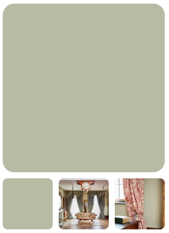
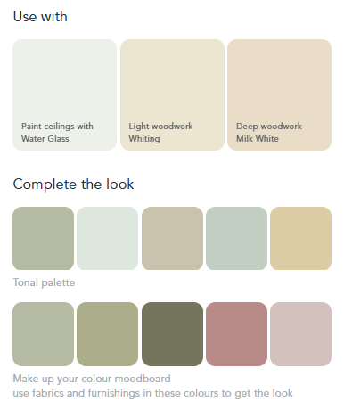
‘Sad colours’ were well understood and well used back in the C17th. They were actually rather beautiful nuanced tones of a range of shades; to quieten them down and settle them into interiors created with polished materials and dyed fabrics. It was a sophisticated response to decorating hierarchy and as such is as useful today – but could we call this subtle grey green Sad Stone? Of course not these days, so we have called it Gladstone! Glad to also offer tonal harmony in all our colours, from ultramodern interiors to period properties – we produce natural paint which is breathable and kind to nature.
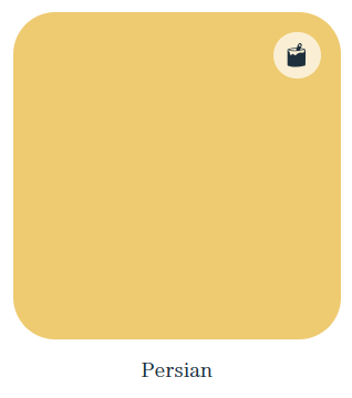
Persian
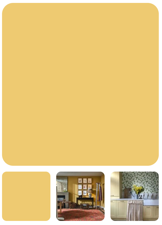
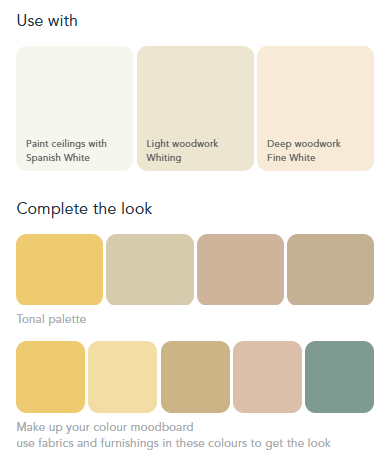
This is a strong brown yellow that will work well with polished timbers and high contrast trim colours/whites. It is warm but bold and will stand up to eye-catching furnishings. The name comes from the use of Persian buckthorn to create strong yellow dyes many centuries ago, although often it was superseded by other names when processed into pigments – even Dutch Pink! Like our Persian, all our natural paints are created to avoid the harmful impact on our health as well as showing the beautiful pigmented colour.
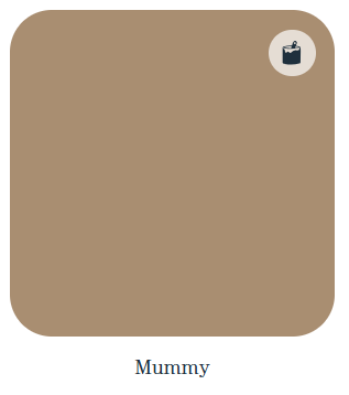
Mummy
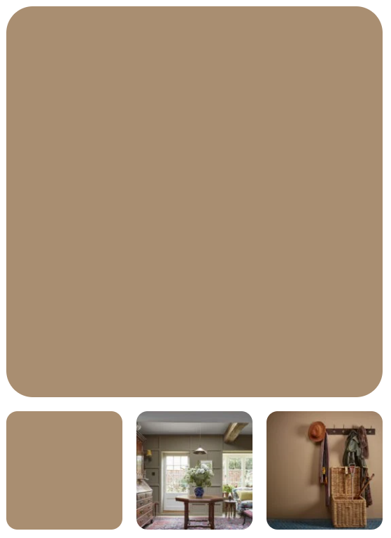
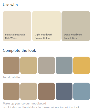
From frankly unpalatable beginnings Mummy became a recognised term (even mentioned by Shakespeare) for an old brown. As you might guess, it described the appearance of mummified remains and indeed was made from them until the late C19th when it became deeply unfashionable. Now that it would be unthinkable to create a colour in this way I feel at liberty to use it for a colour that is rightly fashionable again! Warm and inviting, perfect for a snug or cosy sitting room.
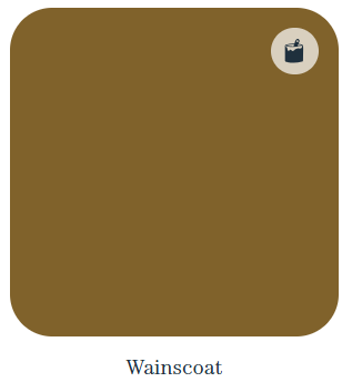
Wainscoat

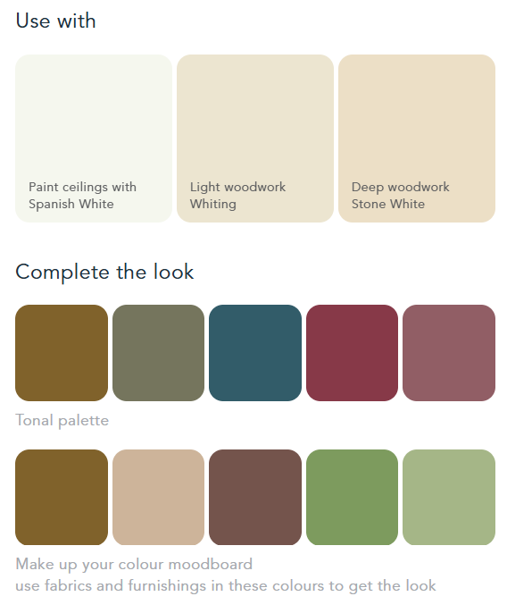
Wainscoat is an old fashioned term for timber cladding used to fit out the interior of rooms in the 16th and 17th centuries. Despite its traditional name this colour has a very modern aesthetic. It is as soft as suede and has a velvety feel that makes it instantly chic and comfortable.
Pair it with almost anything – that’s the great thing about these rich browns!
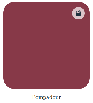
Pompadour
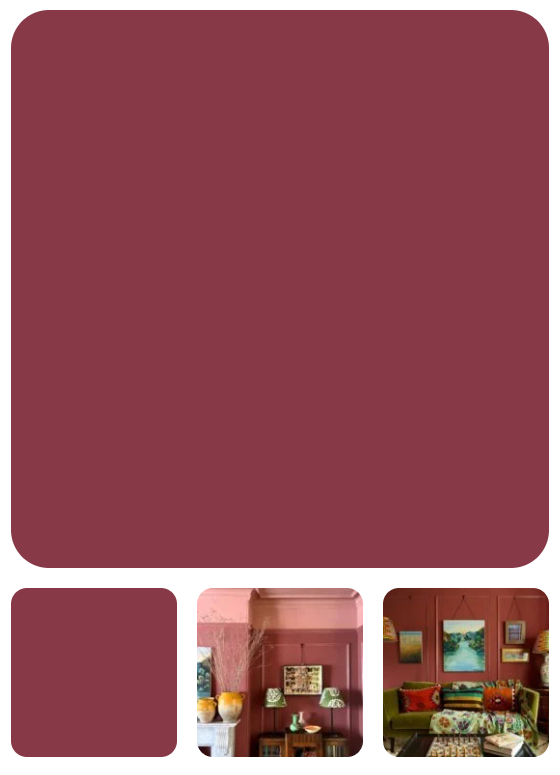
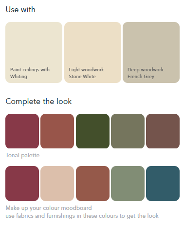
A high-class historical name for a deep and meaningful colour which is basically a purple brown dark iron oxide pigment. We come by our colour with a range of earth and mineral pigments to arrive at a rich reddy tone that turns walls into a serious exercise in colour. This tone is surprisingly accommodating however and will give you a dramatic backdrop for the display of artwork. Like our historical Pompadour colour, all our natural paints are perfect for period properties and we can assure you the walls can maintain their breathability for the next 200 years.
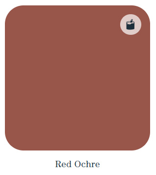
Red Ochre
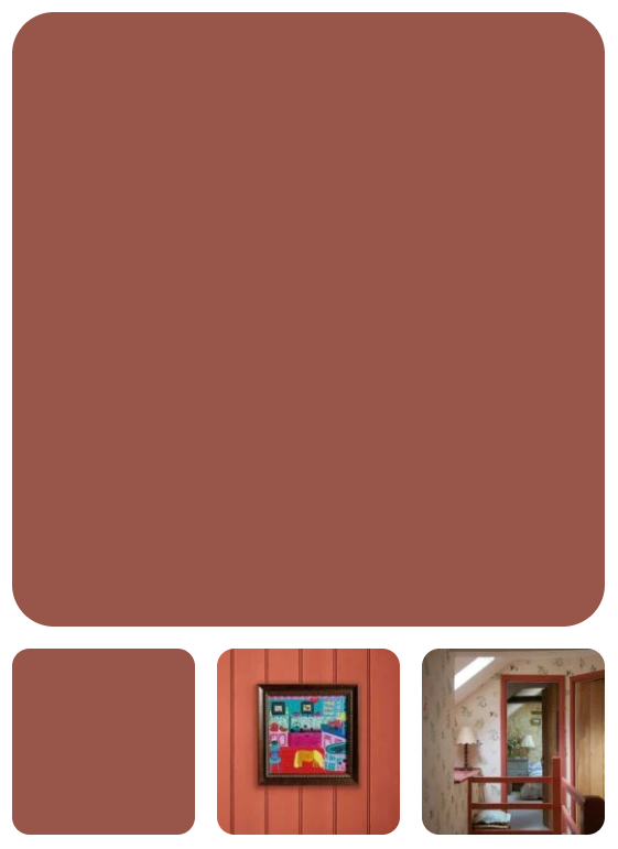
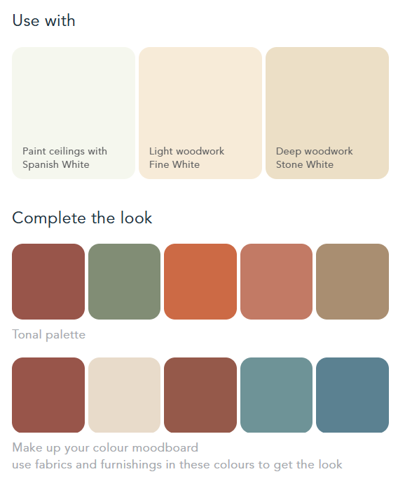
A true earthy red is often best if just made from a true red earth. In the past it often was, as well as being created from heating yellow ochre to turn it red. Our red ochre is a deep, rich hue that would be recognised by an 18th century painter but is still the best way to get a red that does not dominate a room and is a great backdrop for the display of all sorts of art and objects


