Edward Bulmer – The Northern Light Pallette

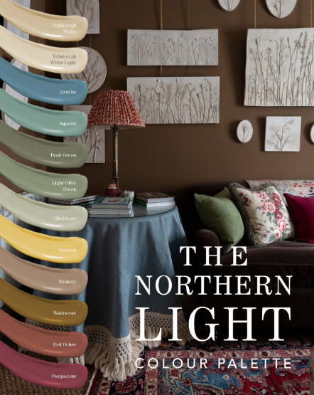
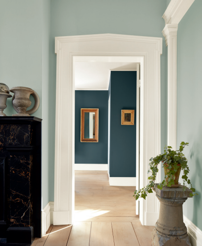
Rich Colours For Any Setting

Our Northern Light palette removes uncertainty with a harmonious range of complementary tones.

It features two new off-whites, ‘Edinburgh White’ and ‘Edinburgh White Light’, designed to pair seamlessly with the palette’s deep earthy hues.

Bringing softness and balance to low-light spaces.

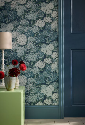
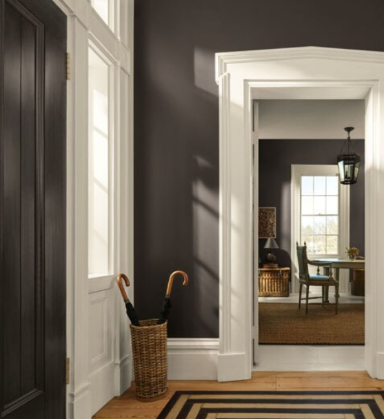
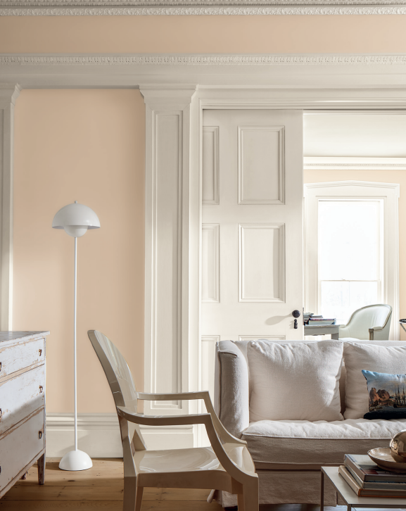
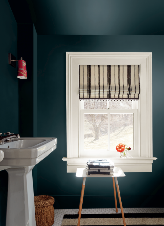
Take the guesswork out of decorating rooms that lack the benefit of abundant natural light, such as north-facing rooms, basement rooms, or any room where the quality of natural light is diffuse and cool.
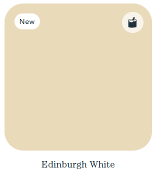
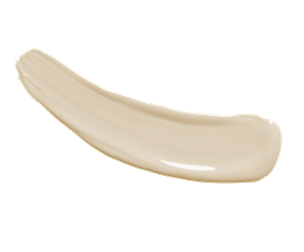
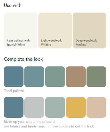
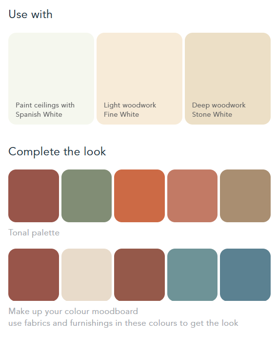


Edingburgh White

Inspired by the grand country houses of Scotland Edward collaborated with Edinburgh interior designer Jessica Buckley to create this beautifully rich shade of off-white; perfect for using in any north-facing room or one which doesn’t benefit from good natural light. The warm pigmentations counterbalance cool blue-grey shades of light to ensure a warm and enveloping result. Use on walls or woodwork by itself, or team with Edinburgh White Light to achieve a variance of tones.


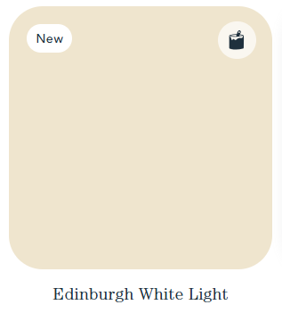
Edingburgh White Light

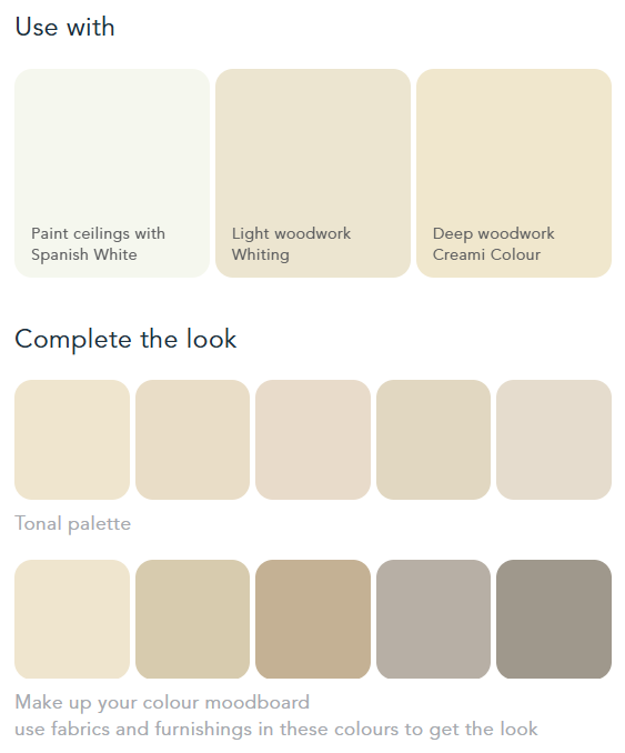
A lighter tone of Edinburgh White, this shade works perfectly for ceilings and woodwork when paired with Edinburgh White or any of the shades from the “Northern Light” palette
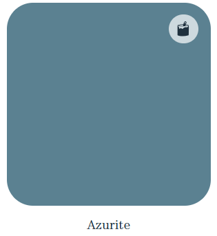
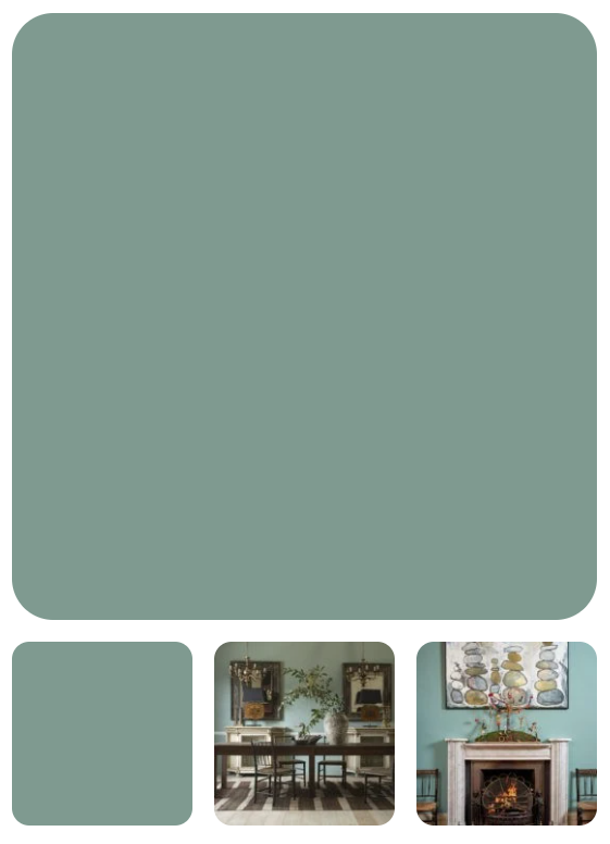

Azurite

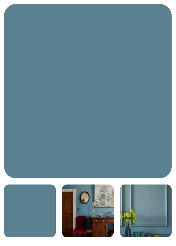
This blue is a real pick-me-up, packed with pigment to give strength and depth, but with earthy warmth. It is a homage to the mineral widely used since the Middle Ages to convey great creativity and high status. A great choice for repainting kitchen cupboards paired with lighter walls.  Our paints are vegan and baby, pet and child friendly so perfect for the kitchen.  We also love Azurite in our dining and living spaces, jewel like at night and colourful during the day.
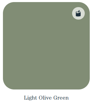
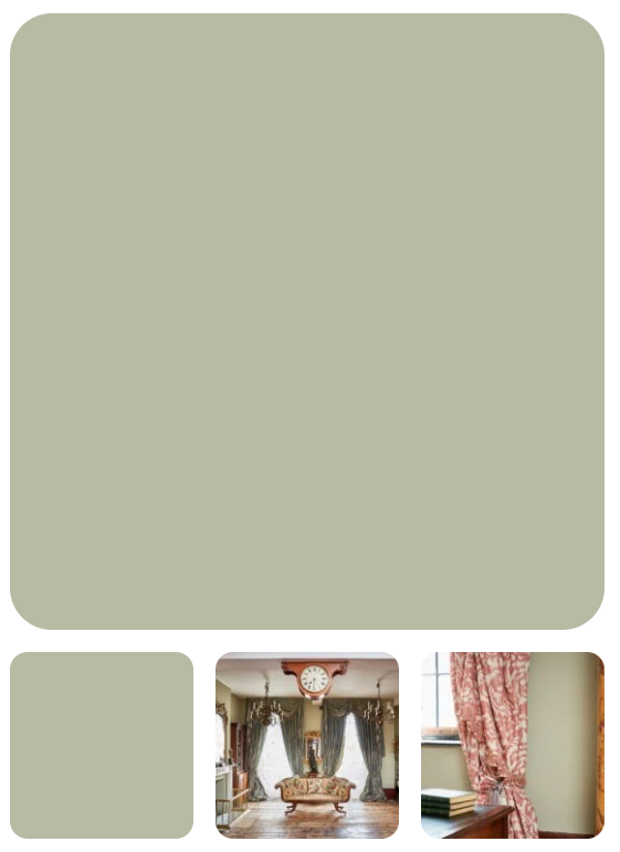
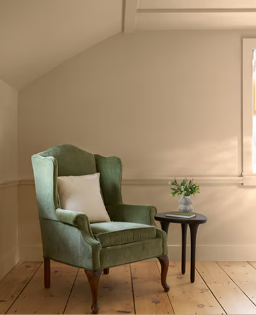

Light Olive Green

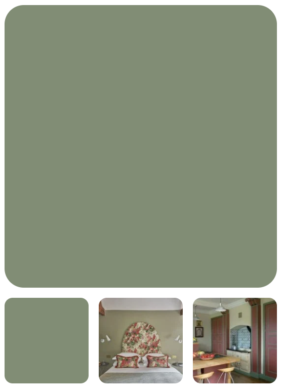
Early recipes for olive green seem to have been a browny hue but by the C19th the addition of Prussian blue meant that it was a full green close to the colour of a plump Mediterranean olive. Too dark and the colour tends to black when in the shade, so I have kept it a strong mid tone. It can be a great woodwork colour and is also robust enough for exterior use. Painting a greener future, our Light Olive Green is derived from natural sources like plant oils and mineral pigments.
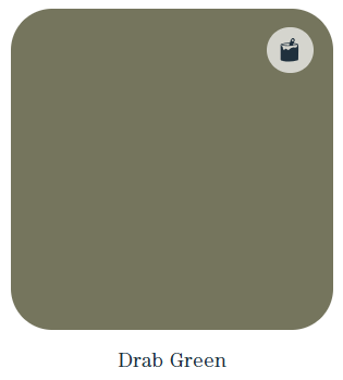

Drab Green

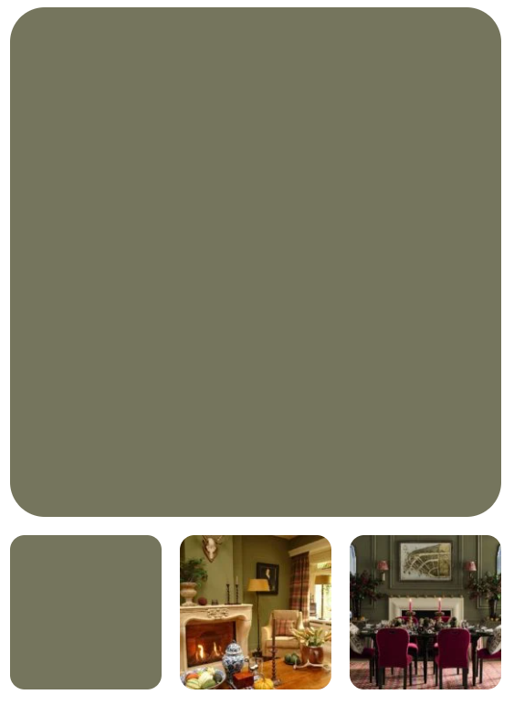
Drab referred to an un-dyed cloth (the French drap) and its use in colour terminology came to mean a lightish brown. C18th accounts refer to drab green and we have taken this idea to mix a beautiful brown green in defiance of its name. I have seen this colour used by clients to create really grown up rooms with depth and self-assurance. Great as an all-over colour for wooden panelling.  Drab Green is a natural paint, made from natural raw materials and so breathable and the smarter choice of paint for period properties. Never drab, always green, in every way.
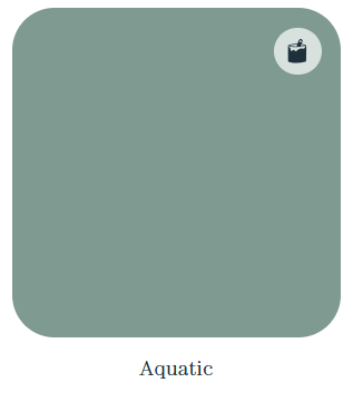

Aquatic

Is it blue, is it green?  We don’t know but it is the changing colour of water and water is completely life enhancing!  Using water to describe a colour is still the cop out it has always been since first used in Colourman’s catalogues in the C18th.  Water is so fundamental to our brand as our water based emulsion and eggshells are made with innovative recipes for a greener (or bluer!) future.  Aquatic will bring depth and sophistication to your space.  Right between the blues and the greens, this colour has been used from the Georgian period onwards.  Environmentally friendly paint at its finest!
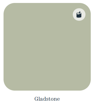

Gladstone

‘Sad colours’ were well understood and well used back in the C17th. They were actually rather beautiful nuanced tones of a range of shades; to quieten them down and settle them into interiors created with polished materials and dyed fabrics. It was a sophisticated response to decorating hierarchy and as such is as useful today – but could we call this subtle grey green Sad Stone?  Of course not these days, so we have called it Gladstone! Glad to also offer tonal harmony in all our colours, from ultramodern interiors to period properties – we produce natural paint which is breathable and kind to nature.
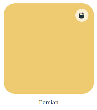

Persian

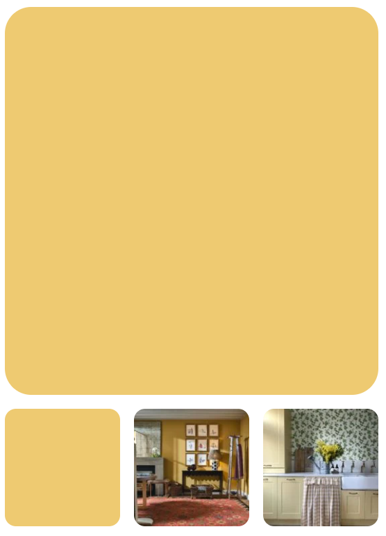
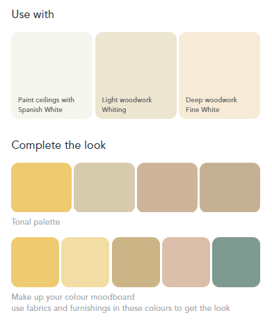
This is a strong brown yellow that will work well with polished timbers and high contrast trim colours/whites. It is warm but bold and will stand up to eye-catching furnishings. The name comes from the use of Persian buckthorn to create strong yellow dyes many centuries ago, although often it was superseded by other names when processed into pigments – even Dutch Pink! Like our Persian, all our natural paints are created to avoid the harmful impact on our health as well as showing the beautiful pigmented colour.
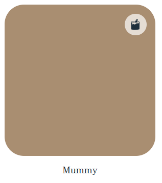

Mummy

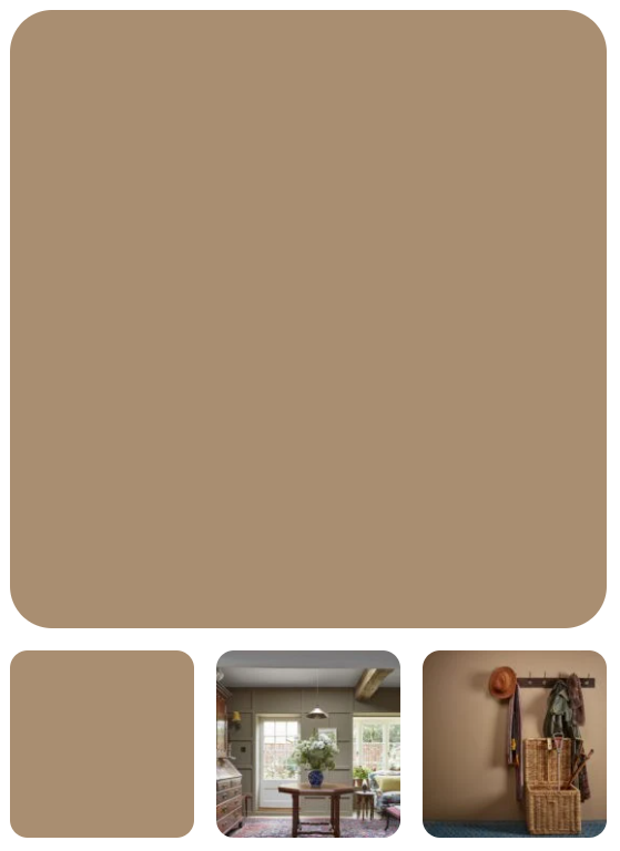
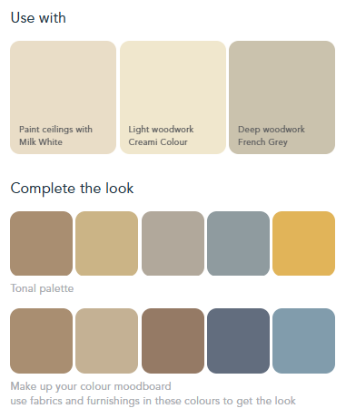
From frankly unpalatable beginnings Mummy became a recognised term (even mentioned by Shakespeare) for an old brown. As you might guess, it described the appearance of mummified remains and indeed was made from them until the late C19th when it became deeply unfashionable. Now that it would be unthinkable to create a colour in this way I feel at liberty to use it for a colour that is rightly fashionable again! Warm and inviting, perfect for a snug or cosy sitting room.
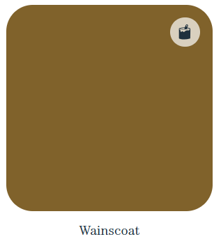

Wainscoat

Wainscoat is an old fashioned term for timber cladding used to fit out the interior of rooms in the 16th and 17th centuries. Despite its traditional name this colour has a very modern aesthetic. It is as soft as suede and has a velvety feel that makes it instantly chic and comfortable.

Pair it with almost anything – that’s the great thing about these rich browns!
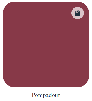
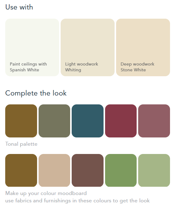

Pompadour

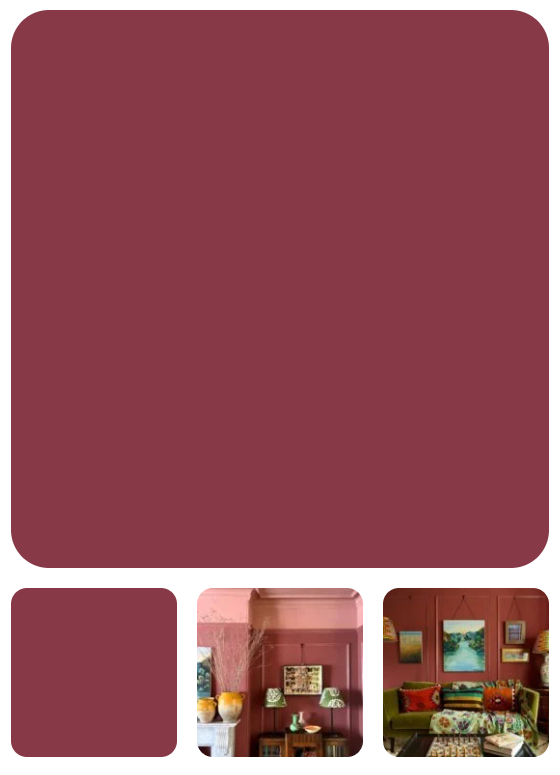
A high-class historical name for a deep and meaningful colour which is basically a purple brown dark iron oxide pigment. We come by our colour with a range of earth and mineral pigments to arrive at a rich reddy tone that turns walls into a serious exercise in colour. This tone is surprisingly accommodating however and will give you a dramatic backdrop for the display of artwork. Like our historical Pompadour colour, all our natural paints are perfect for period properties and we can assure you the walls can maintain their breathability for the next 200 years.
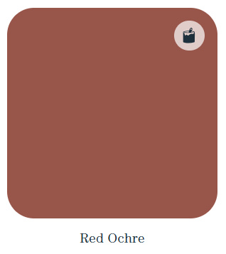
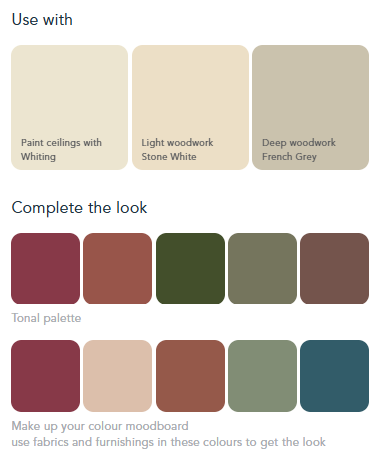

Red Ochre

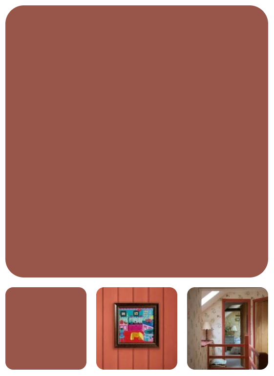
A true earthy red is often best if just made from a true red earth. In the past it often was, as well as being created from heating yellow ochre to turn it red. Our red ochre is a deep, rich hue that would be recognised by an 18th century painter but is still the best way to get a red that does not dominate a room and is a great backdrop for the display of all sorts of art and objects


Little Greene – In the Garden Wallpapers

‘In the Garden’ is the sixth instalment of authentic wallpaper designs in collaboration

with the National Trust.

Comprising eight designs, each pattern has been inspired by English gardens.


Lily Pads


Within the Stackpole Estate in the south-west corner of Wales, nature thrives in over five

square miles of protected coastline, farmland, forestry and lakes.


Besides sightings of bats in the woodland and dolphins in the sea, one of the visitor

highlights are the wild otters which can sometimes be spotted amongst the lily pads within

the estate’s 100 acres of lakes.


Dragonflies, kingfishers, butterflies and tiny water boatmen are also depicted in this

expansive celebration of native British flora and fauna.


Available in 4 colourways.


Castle Garden


In 1930, the dilapidated Sissinghurst castle and gardens in Sussex, was bought by the

20th-century poet and writer Vita Sackville- West and her husband.

Despite having no formal training in garden design, Vita dedicated the next 30 years

to transforming the gardens. Creating unconventional planting schemes, she was motivated

by the way the colours and scents of the flowers in bloom impacted on the experience of

exploring the grounds.


Having hosted an alumni of mid-century, high-society guests, Sissinghurst is now one of the

most-visited and best-loved gardens in England, and this wallpaper has been designed and

coloured to pay tribute to its eclectic vibrancy.


Available in 3 colourways.


Magnolia Blossom


Known for their fragrant flowers, distinctive seedpods and transformational annual blossom,

Magnolias are in fact among the oldest tree species in the world.


This wallpaper depicts four cherished specimens in the care of the National Trust at

Nymans in Sussex, Bodnant in North Wales, and the estates of Lanhydrock and

Trengwainton in Cornwall.


Their soft petals – in bloom and as fallen blossom – are a sight to behold every Spring.


Available in 5 colourways.


May’s Tulip


May Morris, the daughter of celebrated design icon William Morris, inherited not only her

father’s business and some of his status, but was a highly skilled protagonist of the

Arts & Crafts movement herself.


Born in 1862 in Red House in south London, May became best known for her work in

embroidery and jewellery. In 1907 she jointly founded the Women’s Guild of Arts which

championed professional female artists and creatives, at a time when industry only

officially recognised male endeavour.


This design is inspired by a beautiful set of late-19th-century weaves of trailing tulips,

lovingly set into panels as a room divider.


Available in 6 colourways.


Moon Daisies


The unrivalled simplicity of the daisy flower has inspired surface design for centuries

from decorative embroidery to ceramics, and fashion items to wallpaper. Taking its title

from an informal name for the ox-eye daisy, which is known for reflecting moonlight alongside

country roads and paths at night, this design features bright yellow flocked centres on daisies

with interlocking stems; a much simpler interpretation than the late-19th-century wallpapers,

found at Oxburgh Hall, that inspired it.


Available in 6 colourways.


Mr Straw’s Greenhouse


In the 1930s, brothers William and Walter Straw inherited their parents’ home in

Worksop, Nottinghamshire and the family grocery business which had served the

community for over fifty years. They shared an active interest in walking, collecting

archaeological and contemporary artefacts, and a humble collection of succulents

and cacti.


In 1993, the house and around 30,000 objects of the era were given to the National Trust

and have been preserved as a fascinating insight into mid-century life in England.

The greenhouse at the end of their garden is still home to an ongoing array of specimens

which have inspired this light-hearted wallpaper design.


Available in 6 colourways.


Rhododendron Walk


Clumped bursts of ancient colour, in the form of rhododendrons and azaleas,

have famously accompany woodland and lakeside walks in the grounds of National

Trust properties as far reaching as Cragside in Northumberland, Castle Drogo

in Devon, Rowallane in Northern Ireland and Sheringham Park in Norfolk.


In a synthesis of historic content and a time-served manufacturing technique, this

paper features an abundance of colourful blooms, bursting towards the light whilst

friendly bees land on their petals. Rendered in nine surface-printed colours in elegant

combinations, this dramatic design aligns with contemporary interior spaces.


Available in 4 colourways.


Rose Garden


This design is inspired by the sensational walled rose garden at Mottisfont Abbey

in Hampshire. Besides being a grand house, built around a medieval priory and steeped

in generations of architectural evolution, Mottisfont is also home to the National Plant

Collection of Rosa; pre-1900 shrub roses.


The roses tended here are exclusively historic species, characteristically fuller in shape

and – unlike a contemporary variety – they flower only once annually. This

concentration of blooming colour and fragrance makes for a sensorially spectacular

visitor experience for a few weeks in early summer every year.


Available in 5 colourways.


Benjamin Moore Colour of the Year 2026 – Silouhette AF-655

Tailored Classics Silhouette weaves a narrative of refined style and grace into this layered

palette of enchanting pales and handsome mid tones.


Silhouette AF-655 is complemented by the seven quintessential hues of our Colour Trends 2026 palette. These colours are artfully curated based on their incomparable presence and ability to layer effortlessly for a sophisticated feel.  

With a focus on attention to detail, craftsmanship and refinement, the

Colour Trends 2026 palette reflects a graceful balance of enchanting pales and handsome mid-tones.

Raindance 1572

Raindance

Easy going grey undertones bring an

effortless versatility to this steely green

First Crush CSP310

First Crush

Infused with a hint of blush, this tender hue

brings a subtle warmth to any space

Swiss Coffee OC-45

Swiss Coffee

An essential white paint color with just

the right amount of warmth

Batik AF-610

Batik

Violet and rose come together to create

this surprisingly versatile dusty hue.

Narragansett-Green HC-157

Narragansett Green

A blackened teal that conveys a strong sense

of history and architectural relevance.

Southwest Pottery 048

Southwest Pottery

A nuanced hue that captures the brown

and red tones of kiln-fired clay.

Sherwood Tan 1054

Sherwood Tan

A classic tan infused with notes of earthy brown.

Silhouette AF-655

Silouette

Reminiscent of tailored suiting, this elegant colour weaves rich espresso hues with refined notes of charcoal.