NEW WhatsApp Group Chat


Introducing the GC Johnson WhatsApp Business Group!

We are excited to launch the official GC Johnson WhatsApp Business Group, a dedicated, high-value channel created specifically for our Customers.

This group is designed to streamline communication, foster closer professional relationships, and provide immediate access to the information you need to succeed with GC Johnson.


Crown Trade – Colour of the Year 2026 – Colour Insights

Today, there are a myriad of trends, some fleeting, others more far-reaching and long-lasting.

Through Colour Insights we explore the political, technological, environmental, and

societal trends that are helping shape the global landscape. And, in particular,

the influences they’re having on the world of design, colour and paint.

Our experts use their in-depth industry knowledge to predict the colours of the future

– inspiring interior designers, architects, professionals and specifiers to scope

out styles for projects of tomorrow, today.

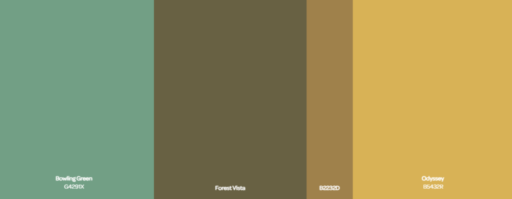
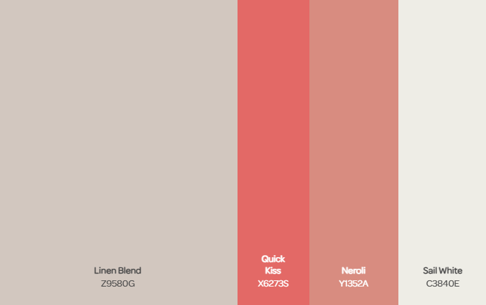
Colour proportions

The colour palette includes near primary red, yellow and green, as well as hot pink for

strong accents joined by gentle pink and blue pastel shades.


At the core of Choreography is a melody of organic shapes, curves, and a rhythmic flow

that emphasises sensory comfort. Featuring warm, muted tones, like soft lilacs and

greens, alongside deeper shades, the palette offers a calming and cocooning effect,

that evolves to the individual.


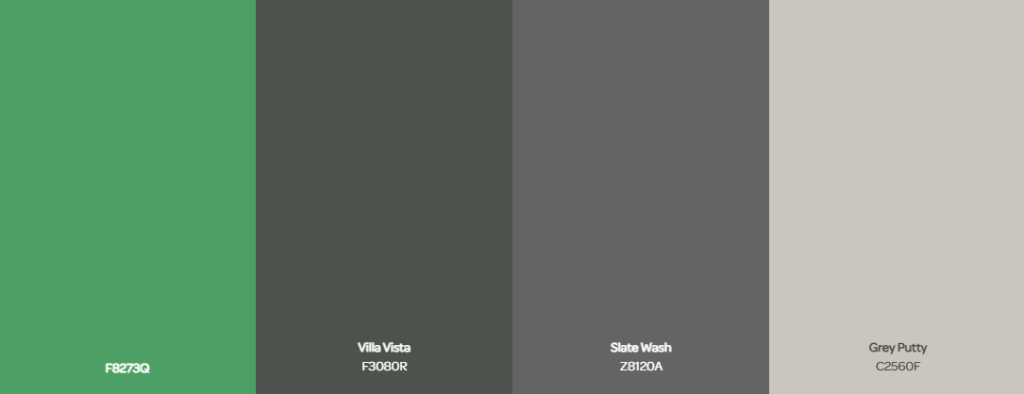
CO influences the creation of harmonious spaces, bringing a balance that can

foster both productivity and relaxation. A mix of calming green and grey tones serve

as a foundation for Co, while vibrant pops of yellow and red inject energy and joy.

The colour palette is intentionally saturated to maintain maturity and avoid

overwhelming brightness, achieving a modern, neutral base that

supports community and connection.


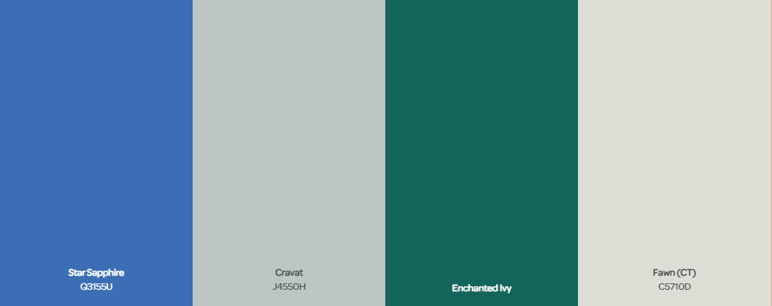
Dynamic and high-energy, Disrupt provokes interaction and sparks emotion, offering

a bold contrast to quieter, more personal spaces. The synthetic, digital-inspired

palette features clashing colours including electric blues and vibrant orange

and yellow accents, combined with grounding grey tones.


A futuristic, personalised design experience, where technology enables endless possibilities

for individual expression is at the heart of Faraway. The palette features iridescent hues,

with digital blues and purples balanced alongside warm greens to prevent coldness

and reflect light in ways that allow each space to transform.


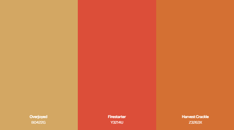
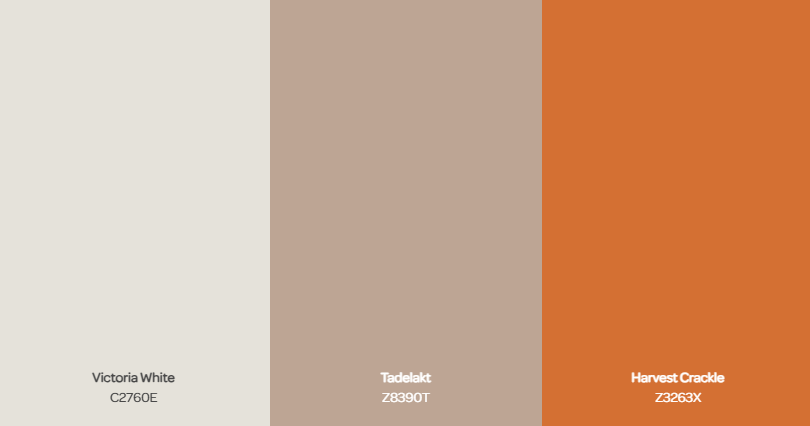
G-local emphasises the fusion of local craftsmanship with global perspectives,

celebrating the intersection of traditional materials and new technologies.

A neutral base palette is accented with subtle injections of synthetic green and

orange tones, reflecting the harmonious marriage of nature and innovation.


Tikkurila Colour of the Year – Chameleon L391

Introducing Chameleon L391, our Colour of the Year for 2026.

A rich ochre with natural warmth, it creates interiors that feel both grounded and dynamic. Inspired by golden light and sunlit horizons, it brings confidence and vitality into the home.

Chameleon L391 proves that colour can be bold, expressive, and enduring all at once.

Radiating warmth, Chameleon L391 wraps spaces in an inviting glow that feels energising from morning through to evening.

Quietly Bold

Confident without shouting, Chameleon L391 brings calm strength and cohesion to a space.

It flatters natural materials and soft whites, and balances beautifully with charcoal greys or

muted blues. Use it across four walls for a cocooning feel, or as a focus area

that energises by day and softens by night.

Effortlessly Versatile

Chameleon L391 adapts to space and light. In daylight, it feels uplifting and sun-warmed by evening,

it softens to a calm, cocooning glow. It excels next to natural materials such as oak, linen, or

brass, and sits comfortably with both modern and period details.

Pair with crisp whites and charcoals for definition or muted blues and teals for a more

relaxed scheme. In smaller rooms, it reads cosy rather than heavy, and in open-plan spaces

it quietly pulls zones together.

Changing light brings out new sides of the colour. In south-facing rooms it doubles

down on warmth, glowing with golden energy, while in cooler light from

north-facing spaces, it softens  to create comfort and balance. This adaptability ensures

it always feels alive, offering fresh character throughout the day.

Key Interior Trends of 2026

Beyond our Colour of the Year, we’re sharing three trends we believe will shape 2026.

Expressive brings optimistic colour and playful shapes. Visionary mixes deep charcoals

with luminous pales for a calm, future-focused feel. Authentic leans into tactile materials

and warm, grounded hues.

Authentic

The Authentic palette celebrates calm and connection, using muted tones that harmonise with natural materials. It’s a grounded approach to colour that creates timeless, welcoming spaces.

Visionary

Visionary explores depth and atmosphere through rich, shadowy shades. This palette brings refinement and intensity, perfect for interiors that feel dramatic yet serene.

Expressive 

Expressive is about confidence and creativity, with bold, playful contrasts that spark joy. Designed for social and creative spaces, it brings energy and character into the home.

Authentic at Home

Here, earthy browns, soft greys, and rich berry tones are paired with wood and woven textures

 to bring depth and warmth. Accents of clay and plum add richness without overpowering,

while softer neutrals keep the palette grounded. Together, the scheme reflects balance,

ease, and an appreciation for the beauty of natural living.

Bringing Visionary to life

In these rooms, the strength of the palette lies in its consistency. Using darker tones across

large surfaces creates a seamless flow, while accents in leather, metal and natural textures

break up the uniformity. Soft pools of light highlight surfaces and shapes,

turning even simple furniture into sculptural features.

The result is a look that feels both modern and timeless, perfect for those who

want their interiors to inspire focus and contemplation.

Bringing Expressive to life

In this scheme, colour is carefully balanced. Tomato M316 delivers intensity and anchors the room

with a striking feature. Milkshake Y411 provides a soft backdrop that calms and complements,

allowing brighter notes to stand out. Sky J356 brings freshness, used across ceiling, floor,

or cabinetry to frame the space. Lemonade H300 introduces a cheerful highlight,

scattered through smaller details that keep the room feeling optimistic.

 Together, the palette feels bold yet harmonious, a true reflection of individuality.