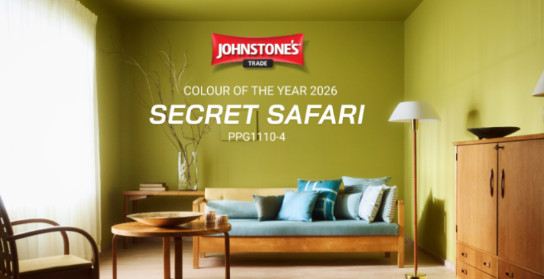
Johnstone’s Trade Colour of the Year 2026 – Secret Safari PPG 1110-4

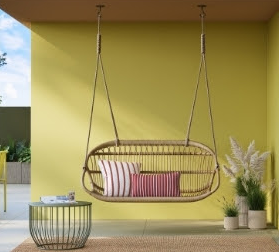
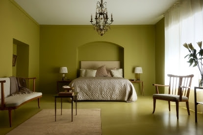
Life’s been a rollercoaster, so it’s no wonder we’re all craving a sense of balance and optimism. That’s where Colour of the Year 2026 steps in — meet Secret Safari (PPG-1110-4), a beautiful yellow-green that brings the calm of nature and a quiet burst of energy into your home. 

This soft olive-lime tone is all about feeling good in your space. It’s gentle enough to soothe, but vibrant enough to lift your mood — whether you’re starting your morning coffee or winding down at night. 

Want to make a statement? Use Secret Safari on an accent wall or mix it with warm metals and clear glass for a look that’s modern and just a little bit luxe. Prefer a more grounded feel? Pair it with natural textures and cozy lighting for a room that feels welcoming and lived-in. 

What makes Secret Safari so special is its versatility. It blends right in with top interior trends — whether your style leans authentic, visionary, or expressive. Most importantly, it’s a shade that gives you room to be you. 

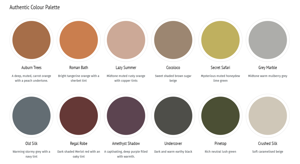
Authentic

Forget fads. Make your home feel like you 

Trends come and go, but the spaces we love most are the ones that feel authentic, warm, and personal. Here’s how to create a home that tells your story: 

Start with grounded colours. Choose earthy tones like brown, terracotta, olive, and lime to bring a natural calm and cozy vibe. Don’t be afraid to go bold. Colour of the Year, Secret Safari, is the perfect starting point. 
 
Decorate with meaning: skip the cookie-cutter decor. Look for vintage finds, handmade pieces, antiques, or travel treasures that hold memories and spark conversation. Or, how about mixing the old with the new? Pair that vintage dresser with a modern lamp. Use grandma’s chair next to a sleek table. Combining styles adds soul and keeps things feeling fresh and lived-in. 

Choose quality over quantity and invest in pieces that last. Natural materials like wood, linen, and stone not only look better with time—they’re better for the planet too. 

At the end of the day, good design isn’t about what’s trendy—it’s about what feels real, comfortable, and totally yours. Decorate with a smile, and you cannot go wrong. 

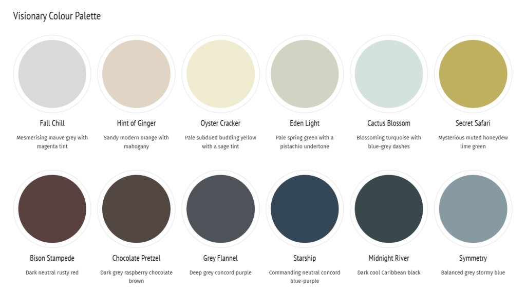
Visionary

Be bold & head to the future

Want your home to feel fresh, modern, and still super cozy? That’s what the Visionary look is all about combining sleek style with comfort and smart living. Mix Colour of the Year Secret Safari with charcoal, black and white and be positively surprised. Here’s how you can bring futuristic vibe into your space: 

Keep it clean and simple: think smooth, wide surfaces like stone counters or streamlined furniture that give your room a polished, clutter-free feel. What comes to choosing colours, mix light and dark tones and play with contrast. Deep shades can pop against whites or soft neutrals. It adds drama without overdoing it. 

Shiny touches go a long way. Add a bit of brushed metal, chrome, or mirrors to reflect light and give your space that sleek, techy edge. And finally, don’t forget to soften it up. Plush rugs, soft fabrics, and comfy seating turn your space into a place you want to relax in. 

Be inspired by The Visionary style and create a home that’s future-ready and still feels like a safe, stylish retreat. 

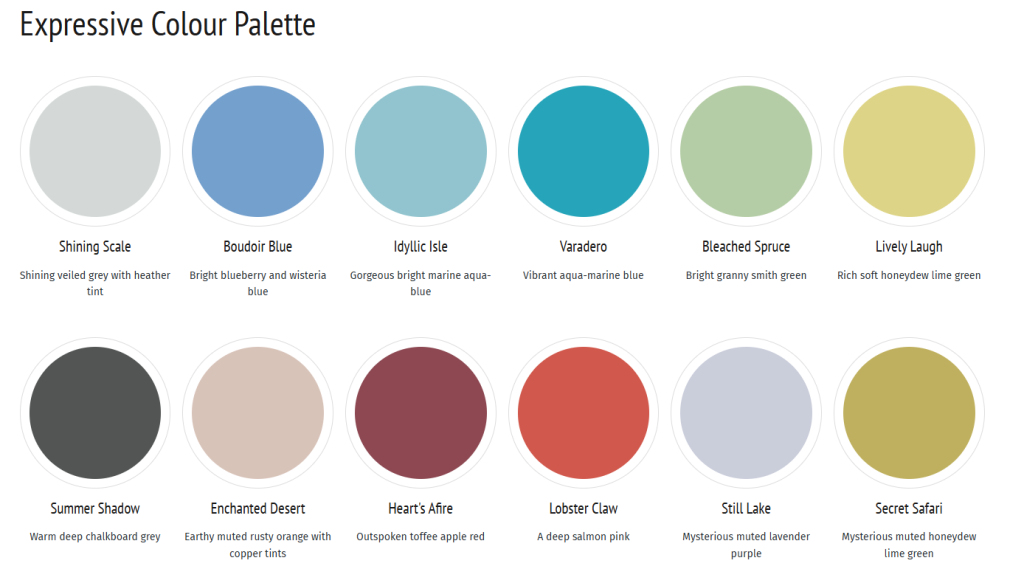
Expressive

Want your space to feel full of life and personality? The Expressive style is all about having fun with your interiors—using bold colors, unique shapes, and feel-good design to reflect who you are. Colour of the Year, Secret Safari is your perfect building block. Here’s how you can bring that energy home: 

Be bold with color. Ditch the all-beige look and dive into vivid, high-energy colors. Think electric blue, hot pink, lime green—or mix them together with color blocking for a playful vibe. And, instead of a plain wall, why not try a bold geometric pattern, a splashy mural, or even a dreamy ombré fade? It’s an easy way to give your space serious wow-factor. 

How about adding some unexpected shapes and styles? Look for curved furniture, puffy silhouettes, or quirky mirrors. A little weird is good. Play with textures and shine: mix it up with glossy surfaces, sheer fabrics, plush rugs, or even glowy lighting. Shiny or see-through elements add a cool, surreal twist. 

Bottom line: have fun. Skip the rules and decorate in a way that makes you smile every time you walk in the room. 

Dulux Trade Colour of the Year 2026 – Free Groove 62BB 08/369

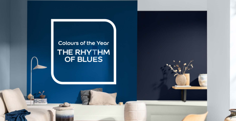
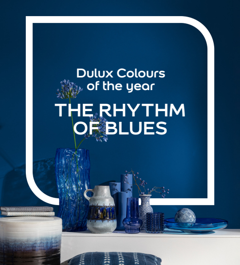
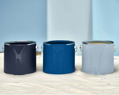
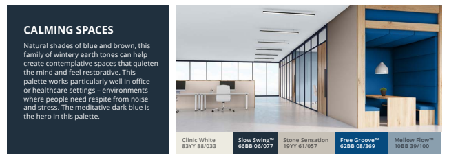
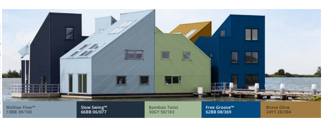
The Rhythm of Blues: The versatile Indigos for all Spaces 2026

Dulux colour experts proudly introduce Colours of the Year 2026, The rhythm of blues.

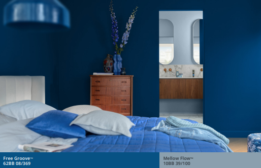
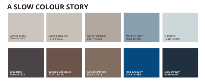
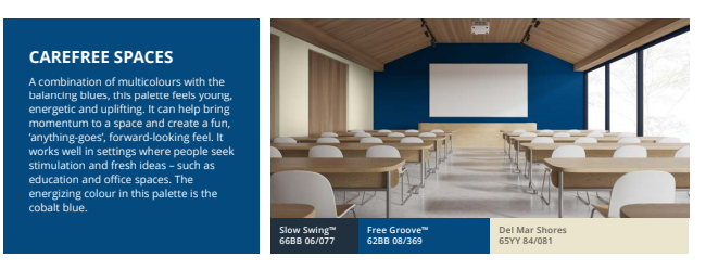
Embrace the Versatile Family of Indigos: a vibrant Free Groove an airy light blue

– Mellow Flow and the meditative dark blue – Slow Swing. These soulful indigo blues

form the perfect balancing tone for 2026, enhancing mood transformation in

commercial spaces, public areas, and residential interiors alike.


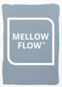
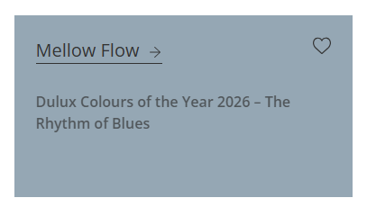
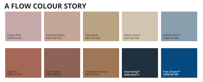
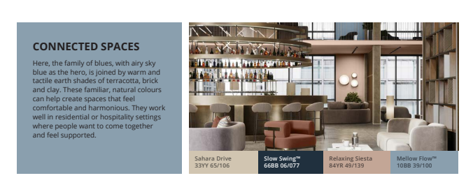
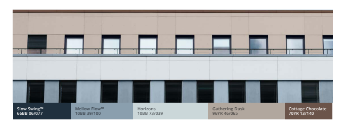
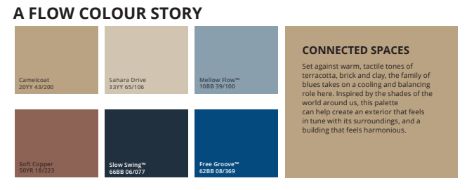
Mellow Flow – 10BB 39/100

The colour of cloudless skies, this natural blue – Mellow Flow – is familiar, timeless and

soothing. A flexible, balancing tone, it works brilliantly with quiet neutrals, warm, earth tones,

and bolder shades. The hero blue in the Flow colour story, it can add an airy, expansive

feel to a space


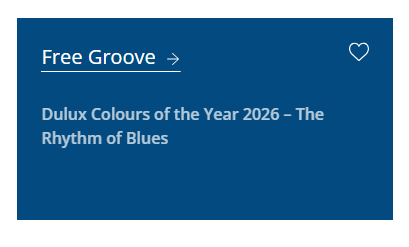
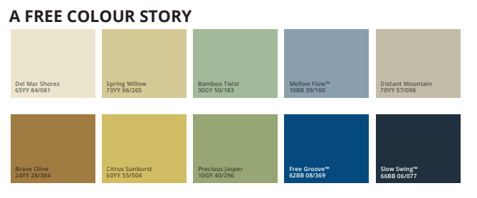
Free Groove – 62BB 08/369

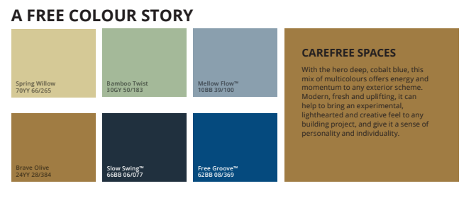
We’ve selected this striking cobalt, Free Groove supported by two other soulful blues. Vibrant

and exciting, it’s an uplifting shade that can bring individuality, depth and a bit of fun to a

scheme. The hero indigo in the Free colour story, it’s gloriously offbeat and upbeat.


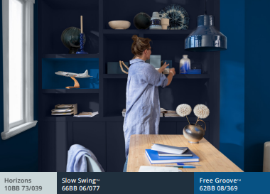
Slow Swing – 66BB 06/077

The meditative Slow Swing brings stability and calm to an interior or exterior. Whether used

for large surfaces or smaller architectural details, it can help to ground a colour scheme and

give it weight. The hero of the Slow colour story, it’s a shade that is deep, dark and

a little bit magical.


Clinic White – 83YY 88/033

This year, we offer a universal neutral that will complement Dulux Trade’s colour stories.

Whether used for interior ceilings, walls or details, this white provides the perfect foil for

all the other colours in the 2026 collection.


Interior Pallettes


Exterior Pallettes


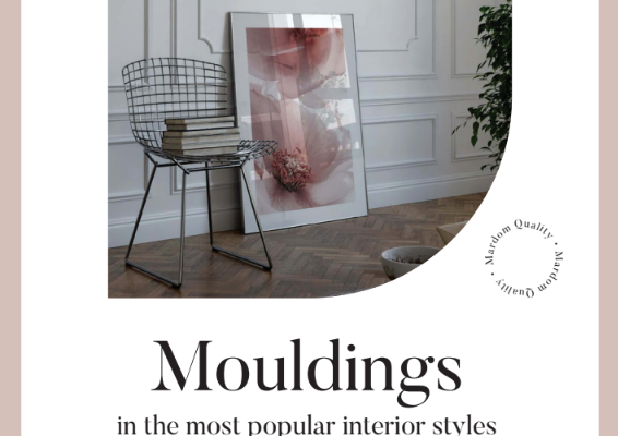
Mouldings

In recent years, mouldings have become a leading trend in interior design. They have broken

away from all the classic patterns and are being used in a completely different, modern way.

We can now find them in almost every interior style – Modern Classic, French, Glamour,

New York, Art Deco and even Scandinavian or extremely minimalist Japan! However,

there are many technical and visual aspects to mouldings that can make them

completely transform and embellish an interior

What is the practical function of mouldings?

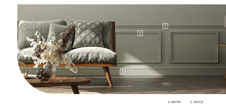
1 – Mouldings reduce the feeling of emptiness in interiors. It makes bare, monotonous

and shapeless walls look dressed up. When we look at pictures of an interior before

mouldings were installed, and then look at the finished wall, we get the impression that

this wall could not exist without mouldings. That without them the interior was stark,

unpolished and boring, and only now has it gained all its charm and character.


2 – Mouldings create repetitive shapes and patterns on the wall, bringing rhythm,

symmetry and harmony to the interior. Walls prepared in this way form the basis for

the next steps in interior decoration. We cannot paint a picture if we have not taken

care of the canvas!


3 – Mouldings are a way of optically modelling an interior, hiding its flaws and

enhancing its assets. By knowing and skilfully applying the principles of proportion, we

can raise, lower, widen and narrow rooms. Add some play with colours and the right

arrangement of mouldings and you will be surprised at the effects you can achieve!


4 – A fourth aspect, perhaps less practical and more visual, is that certain interior styles

simply cannot exist without mouldings. Decorative profiles are an integral part of certain

architectural styles and their absence would be completely incompatible with the most

basic assumptions and canons.


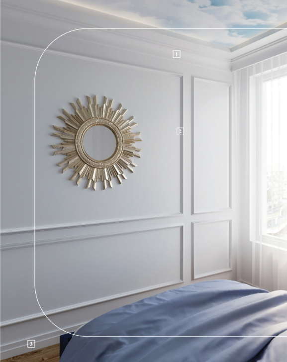
Modern Classic Styles

Modern Classic is nothing more than a modern, lighter version of the classic style.

It refers to rich, palatial interiors, but uses much more subtle and less ornate forms.

Modern Classic is a very feminine style that conveys a sense of harmony, stability, order

and refined taste. In this style you will find many high quality and precious materials

such as marble, silk, velour, glass and wood. Trim elements such as handles, knobs and

small decorative details are often in shades of gold and silver, in both gloss and matt

(brushed) finishes

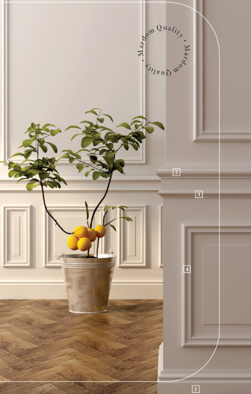
1.MD360 2.MD002 3.MD413 4.MD325

Which picture frame moulding layout to choose?

There are various frame layouts, but some are not conducive to visual modelling of the

interior. A mismatch of proportions can make a room look significantly shorter or smaller.

Here are 3 layouts that always look great in interiors!

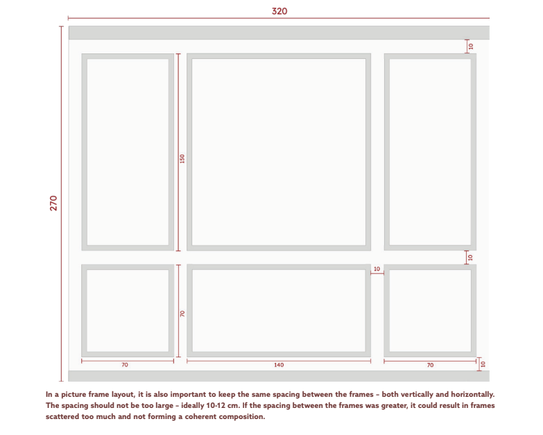
This is a layout created using the principle of selecting the proportion of frames in a ratio of

approximately 1⁄3 to 2⁄3. This layout creates a soaring composition and makes the interior feel

taller. The lower frame should occupy about 30% of the available space and the upper frame

about 70%.


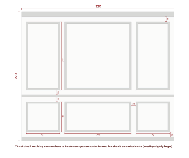
Another great-looking composition is the 1/3 layout enhanced with a chair rail separating the

lower frames from the upper frames. As with the first design, make sure that the spacing

between the elements is even. The lower frame should be approximately half the size of

the upper frame. Bear in mind, however, that any cross-cuts will visually shorten the

space slightly. If you are concerned about modelling the interior and making it

look taller, consider the first layout instead.


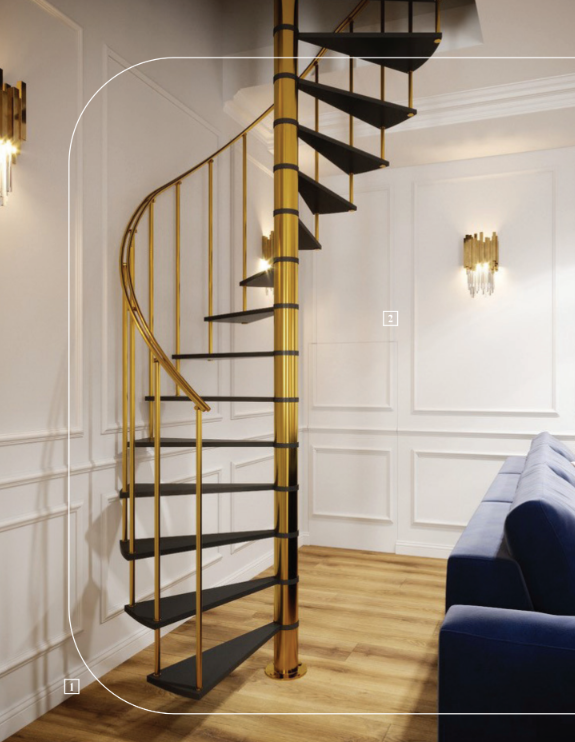
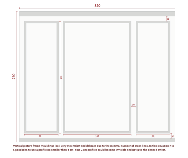
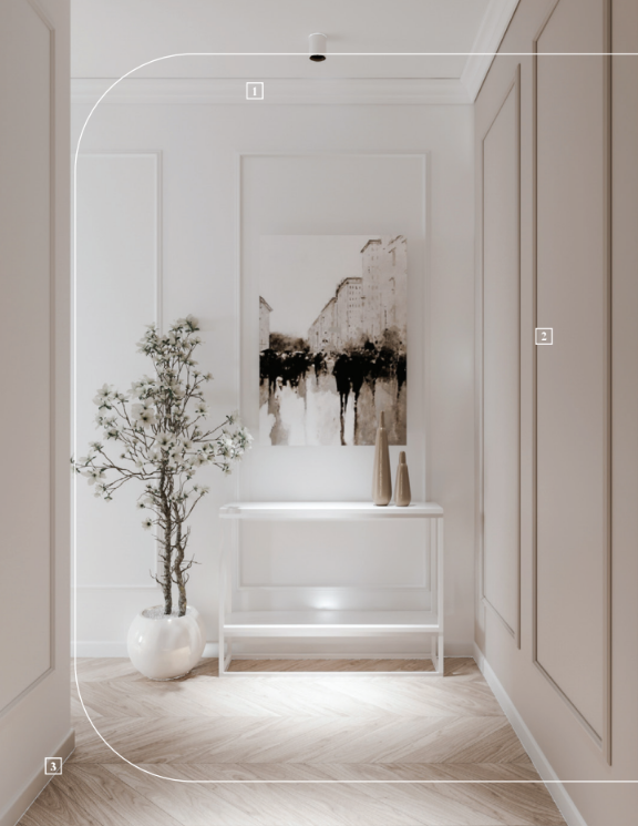
Vertical picture frame mouldings have the greatest effect in visually heightening the interior.

This is because there are few horizontal cut-outs that would visually shorten the room.
They are perfect for interiors with low ceilings and also when you want to go for

total minimalism.

Ceiling decorations

Ceiling decorations are another important element of the Modern Classic style.
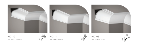
Cornice mouldings are perfect for creating a smooth transition between planes by filling in

the space at the top of the wall. They provide a sense of closure to the composition.

In the Modern Classic style, mouldings with a delicate, decorative millwork are perfect.

Completely plain designs would be too modern, and richly decorated profiles are better

suited to other interior styles, which we are going to discuss later!

So which mouldings are worth considering? Bear in mind that very high cornice

mouldings (around 15 cm and above) will only look good in really tall rooms – in tall

detached houses or tenement houses.

For standard interiors, choose medium-height mould-ings – around 8-12 cm.


Skirtings

Skirting boards are essential for all types of flooring that require expansion joints. An

expansion joint is nothing more than a small gap (usually 10 mm) against the wall to allow

the floor to move freely. This prevents the floor, which may shrink or swell due to

temperature changes, from buckling against the wall. Expansion joints are used with laminate,

vinyl, natural wood or any other flooring that is sensitive to changes in temperature and

humidity. Only ceramic tiles or epoxy flooring do not require skirting boards as they are sealed

with grout. Skirting boards are therefore essential to hide the unsightly gap created when

the floor is laid.

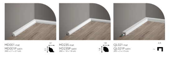
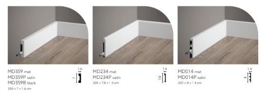
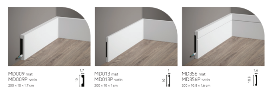
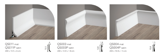
Skirting boards come in many different heights – from 18 mm up to 250 mm! The choice

therefore depends not only on the visual effect we want to achieve, but also on the

function of the skirting boards in the interior.


The following size ranges are assumed:


18–50 mm -> low skirting boards
50–120 mm -> medium skirting boards
120–180 mm -> high skirting boards
180–200 mm -> very high skirting boards

Minimalist quarter round whose only function is to cover the expansion joint

Medium skirting boards for standard-height rooms

Skirting boards with simple designs and slightly larger dimensions

Modern skirting boards