
We are delighted to announce the launch of our refreshed ‘Colours of England’ and ‘Colour Scales’ colour cards.
Discover 26 new colours that have been introduced to our collections.
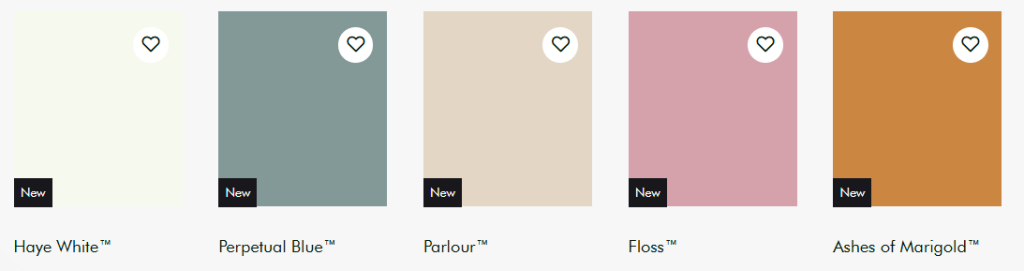
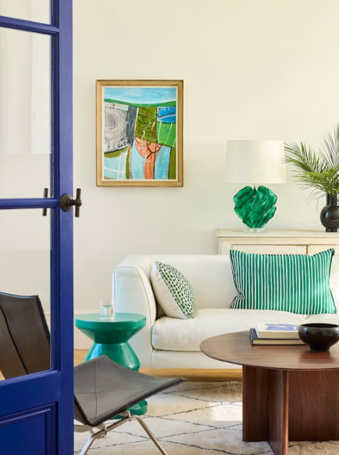
Haye White 346.
“Haye White is a white we felt we were missing on our colour card.
Our most-loved Little Greene whites are Slaked Lime (based on umber) and Silent White (containing both umber and ochre).
Now we also have Haye White, which is made using just ochre.
A true ‘everywhere white’, Haye White offers a beautiful, subtle warmth that will complement many spaces in the home. It’s perfect for north-facing rooms, or any areas that don’t receive so much natural light.”
Perpetual Blue 348.
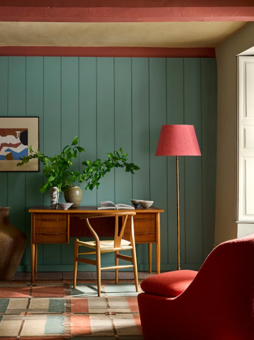
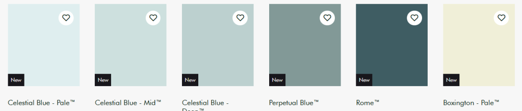
“One of my favourite blues, Perpetual Blue is a stronger, deeper version of our beloved Celestial Blue. Dating back to 1807, Celestial Blue is a true classic of ours, and I think this darker variation will be just as popular.
Perpetual Blue was found on the surviving paint palette of Winston Churchill at Chartwell, a National Trust property. It’s a versatile blue which can appear as green, grey or blue, depending on the light. Great for lots of spaces, I would recommend using Perpetual Blue in a home-working space or a bedroom to provide a beautiful, calming backdrop.”
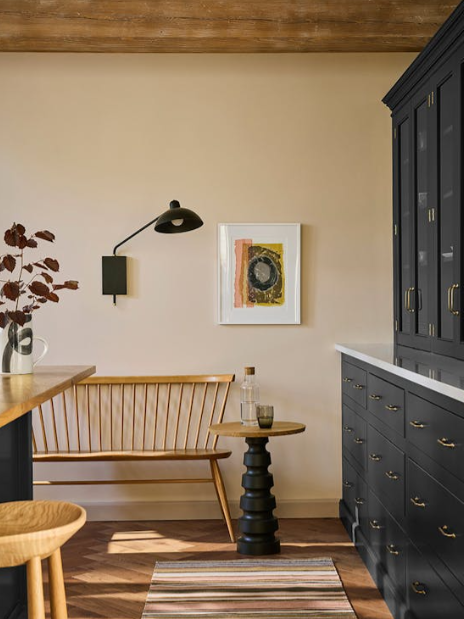
Parlour 347.
“Parlour is a lovely, soft, pinkish off white – a beautiful, warm alternative to a brighter white. This shade was found at the National Trust property,
Dyrham Park near Bath, in a north-facing reception room called the ‘Slop’t Parlour’.
Parlour has real warmth within its makeup, so you can easily use it in north-facing rooms that lack natural light to create warm, inviting spaces. It would work wonderfully in lots of interior settings, but it’s a particularly good choice for a kitchen.”
Floss 349.
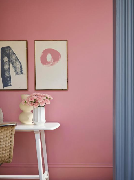
“A playful, fun-loving pink, our new shade Floss stems from the existing bold pink, Carmine. It’s a lighter pink colour that already exists in many of our Little Greene wallpapers, where Carmine would be slightly too strong.
Floss is half the intensity of Carmine, but it still has that element of fun and impact. You can use it as an accent colour, or you can even drench a space in Floss, and it won’t feel too overpowering.”
Ashes of Marigold 350.
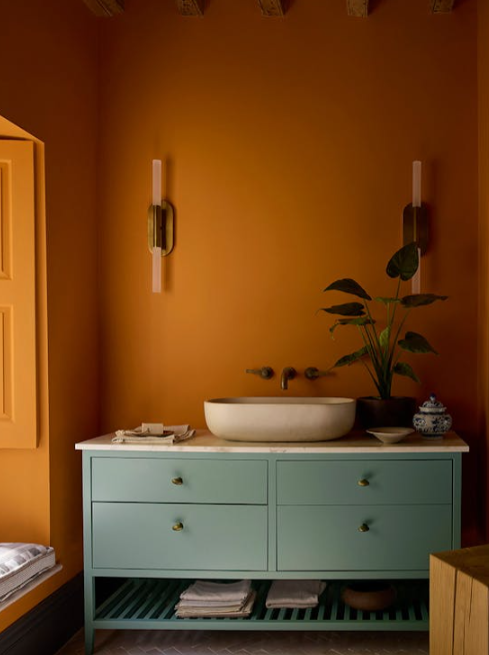
“Our bright orange Marigold is a classic 1970s shade – bold, vibrant and impactful. We’ve now chosen to replace Marigold with the new Ashes of Marigold.
This alternative orange has a muddier undertone, containing more black pigment to create a shade that feels gentler and more subdued.
You can of course still use Ashes of Marigold as an accent colour – on skirting, a chair, a wardrobe. But you can also drench a room in it, for an all-over transformation. It would also work fabulously on kitchen cabinets!”
Colour Scales
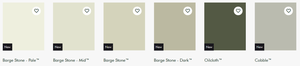
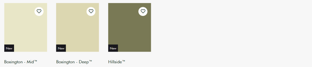
Our updated ‘Colour Scales’ collection features 21 new colours,
including expanded families of colour for 3 much-loved Little Greene shades…
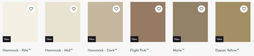
Hammock
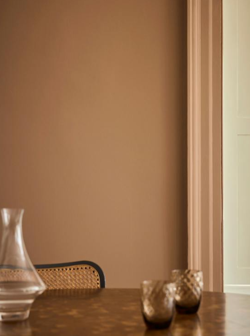
Flight Pink
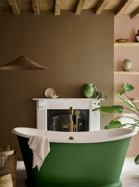
Marle
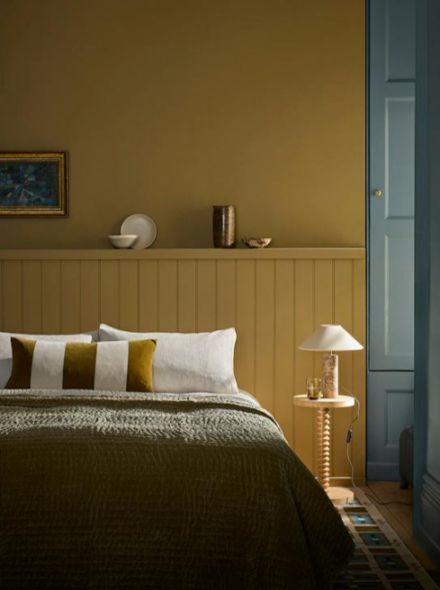
Elysian Yellow
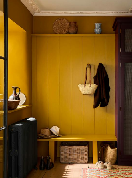
Brulee
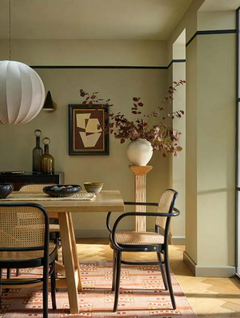
Barge Stone
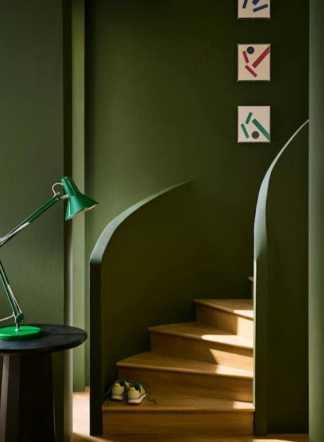
Oilcloth
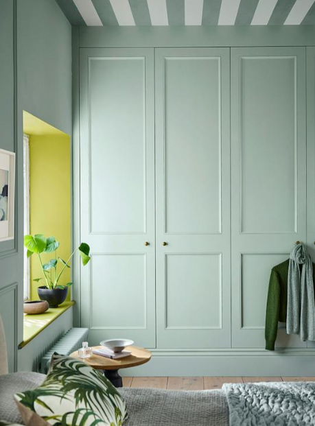
Celestial Blue

Rome
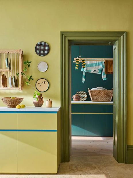
Boxington
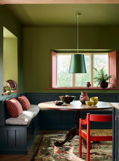
Hillside